When I was young, I really wanted to be an interior decorator. Every wall in my house was painted white, except for my room, which was a soft buttery yellow. When I was about 7 my mom decided to hire an interior decorator for this one room in our house, and I still don’t know why that room was picked, as it was the least formal communal room, containing our tv and my father’s desk. The decorator ended up wall papering one wall, and took about 6 months to coax my mom into painting the rest of the walls a light peach color. I never understood the color scheme in there, and still don’t, but I loved the idea of giving a room some personality through color, shape, texture and furniture arrangement.
I have mentioned on social media that I’ve been in the midst of home renovations. My family and I recently purchased a home that was built in the 1970s, and as a result, requires a bit of work to update the place. I’ve been getting a lot of grief about the colors I’ve chosen for the house. I really decided to go all out for this house and I’m not holding back in the color department, with deep emerald, pale periwinkles, vibrant teal, violet and a vivid green, to name some of the more exciting colors.
But I’ve come to realize that color is one of those things that’s highly subjective, and everyone’s opinion is going to vary based on a lot of factors. The most controversial color is surprising to me – a pale green. The reasons I chose it aren’t important, but the strong reactions to it have been startling – it’s a pale minty bluish green, reminiscent of Baskin Robbins’ Mint Chocolate Chip, but lighter (kind of like the above garnet). In my opinion, a pretty innocuous color.
But that’s the thing, color can have unexpected visceral reactions and people are going to love and hate the same colors, and sometimes won’t even be able to explain why they are having the reactions to the color that they are.
So here is a little bit about color terminology for gemstones. I’ve gone over some of these terms before, but it’s always good to have a refresher.
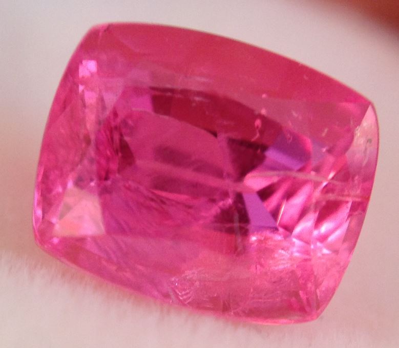
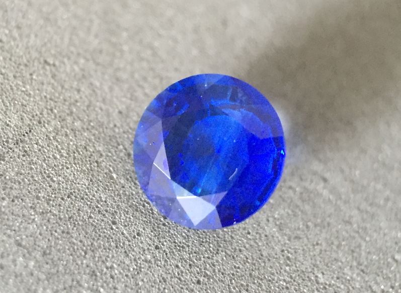
Hue: the color of the stone. “Purple” “blue” “red” “teal” are all hues.
Tone: lightness to darkness of the stone. “Deep in tone” connotes that a stone may have a darker color. “Light in tone” connotes a pale or pastel shade.
Saturation: how much color/pigmentation a stone has, the intensity or vividness of a color. “light” “medium” “intense” “vivid” are all terms that can be associated with saturation.
Modifier: if the stone has a strong primary color, the secondary (or even tertiary colors) are called modifiers.
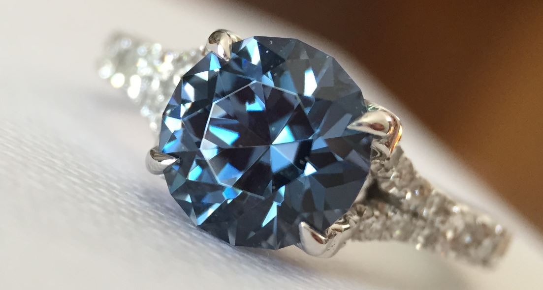
I would describe the above spinel’s color like this: Blue in hue, with medium-dark tone, medium to strong saturation, with a slight green-gray secondary modifier. This stone also shifts to a purple under fluorescent lighting, the rest of the information stays the same in both colorways.
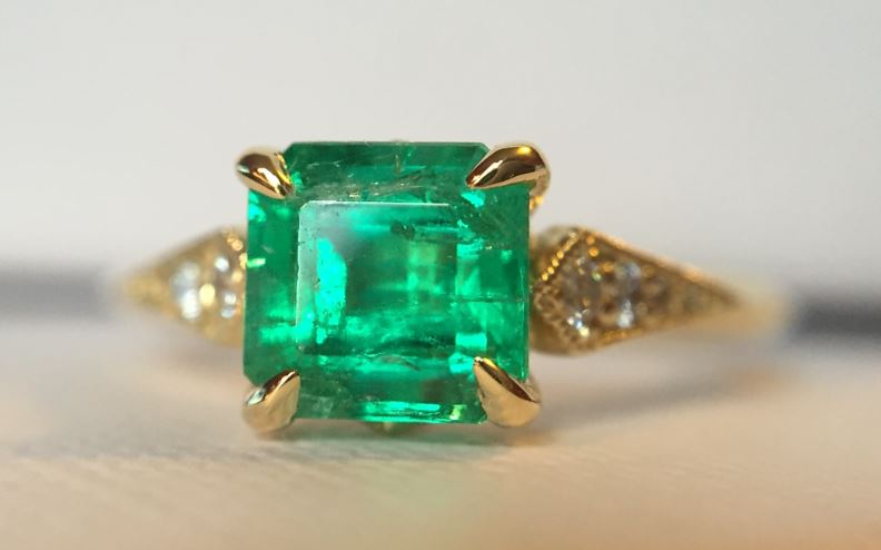
The most highly sought after stones in the colored stone universe are going to be pure of hue, medium in tone and with vivid saturation. A little gray goes a long way to making stones be within a more reasonable price range with typically a barely perceptible difference.
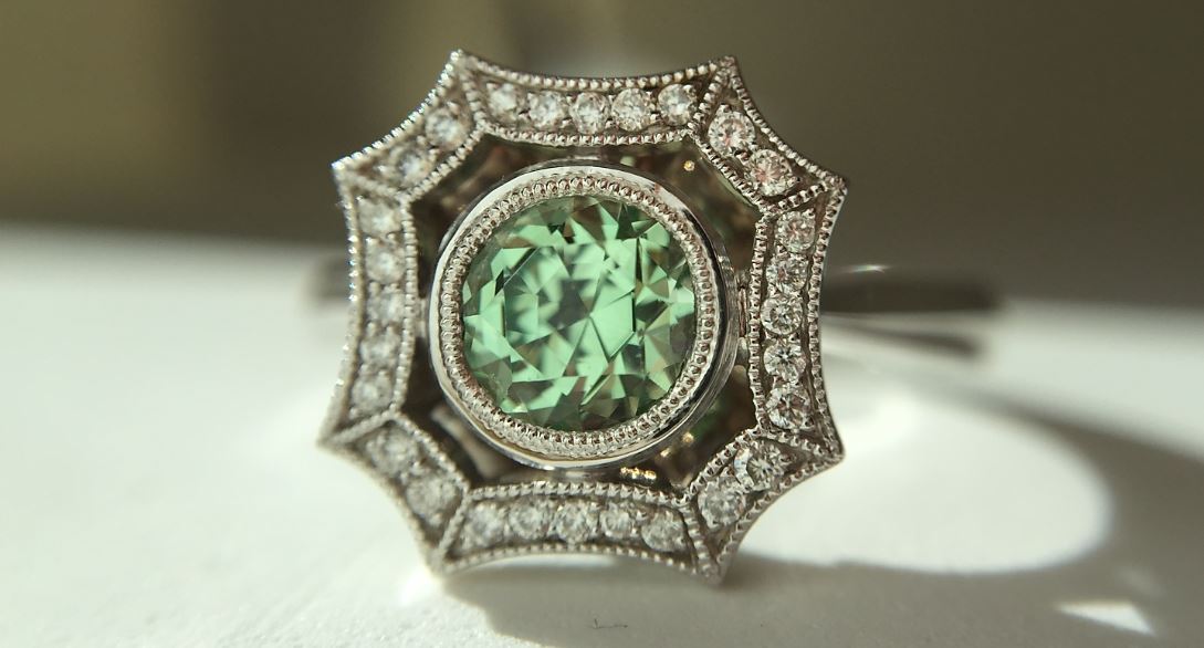
So, I’ve been posting less to Instagram, Facebook, Twitter, etc because I’ve been busy painting and painting and painting. Good thing it’s a labor of love but I will be so happy when it’s over! I have some exciting things planned for the coming weeks, including a Q&A feature with someone in the gemstone world, and a couple fantastic custom projects I’ve been working on over the last few months. I have fun stuff coming up for 2016 too, and I can’t wait to share those things with you as the year progresses!

Leave a comment