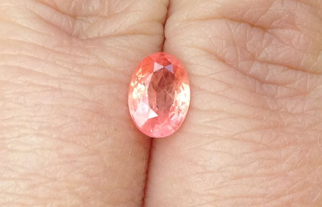
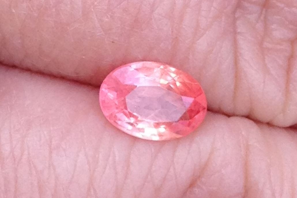
I haven’t had this stone for that long, but it became a quick favorite. I am not a big orange person, but even as a little girl, I was into peach colors. Which is what the padparadscha should have in spades. You might recognize this stone from a previous post.
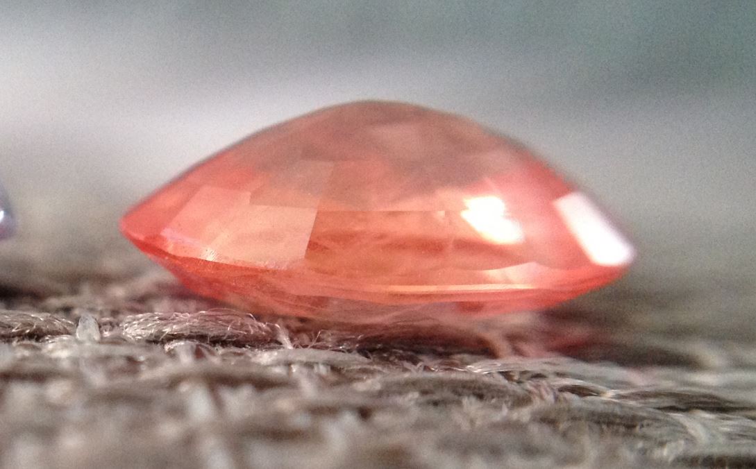
So, as you can see, this particular sapphire has a bit of a depth issue, which results in a larger window. Because of the wonderful color, I decided I didn’t care about the window, but wanted to preserve the beauty of the stone as much as possible.
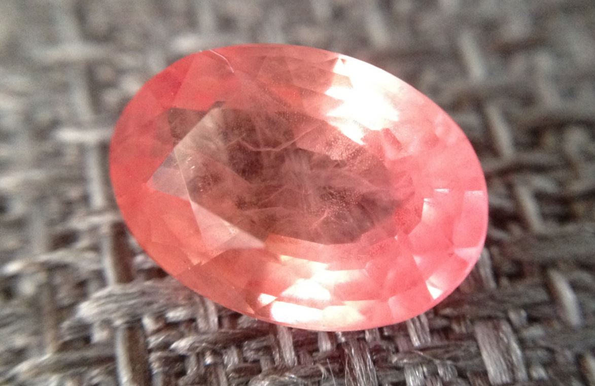
This stone seems to possess some smoke like inclusions, which would lead me to think it’s probably Beryllium infused, but I don’t really care because I love the color that much. If I were going to sell it, I’d probably get it tested by AGL.

I could potentially have someone recut it to get rid of the window, but that would probably diminish the stone size to maybe 4mm if I was lucky, and it’s 5x7mm now. I’ve still considered it, but ultimately decided to embrace it as it is, flaws and all.
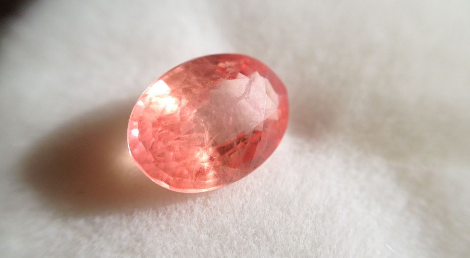
I love how much the color shifts, depending on the lighting situations.
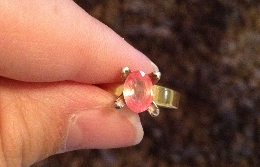
I tried it against several color of metal, such as 18kt yellow gold:
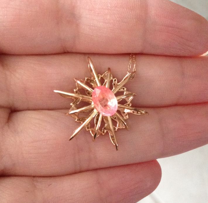
14kt rose gold:
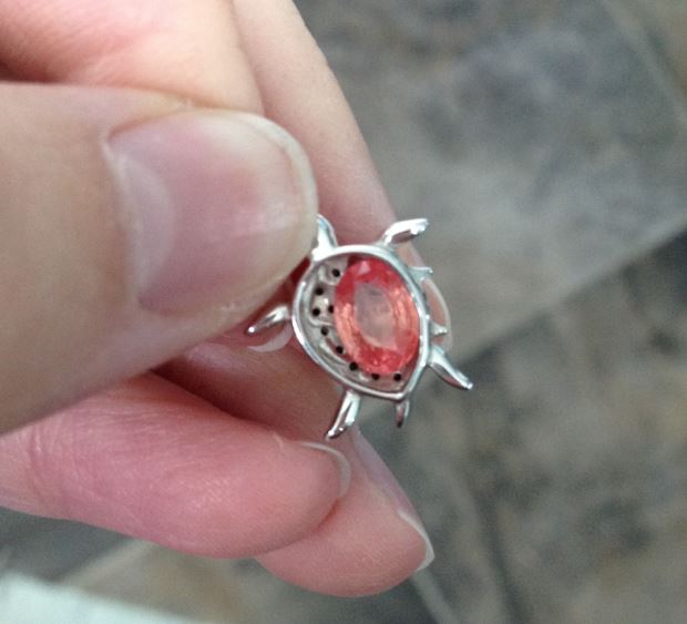
10kt white gold, which kills the color of the stone:
So, here are a rough few sketches of what I started thinking of for it.
First I wanted to address some of the stone’s issues, for instance disguising the window as much as possible. So I wanted to put a detailed relatively solid gallery. I think that designing for stones that have problems is a lot more fun than perfectly cut stones, if I’m totally honest.
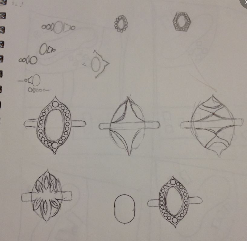

So underneath the stone, I plan to put rose gold since it resembles the color the closest and will disguise the window the most. The shank and the surround/halo (?) will be yellow gold, but I haven’t quite decided what design to go with. This was the most promising idea, but I think I want to go a different direction, so this project is still undergoing revisions and probably will be for a while.
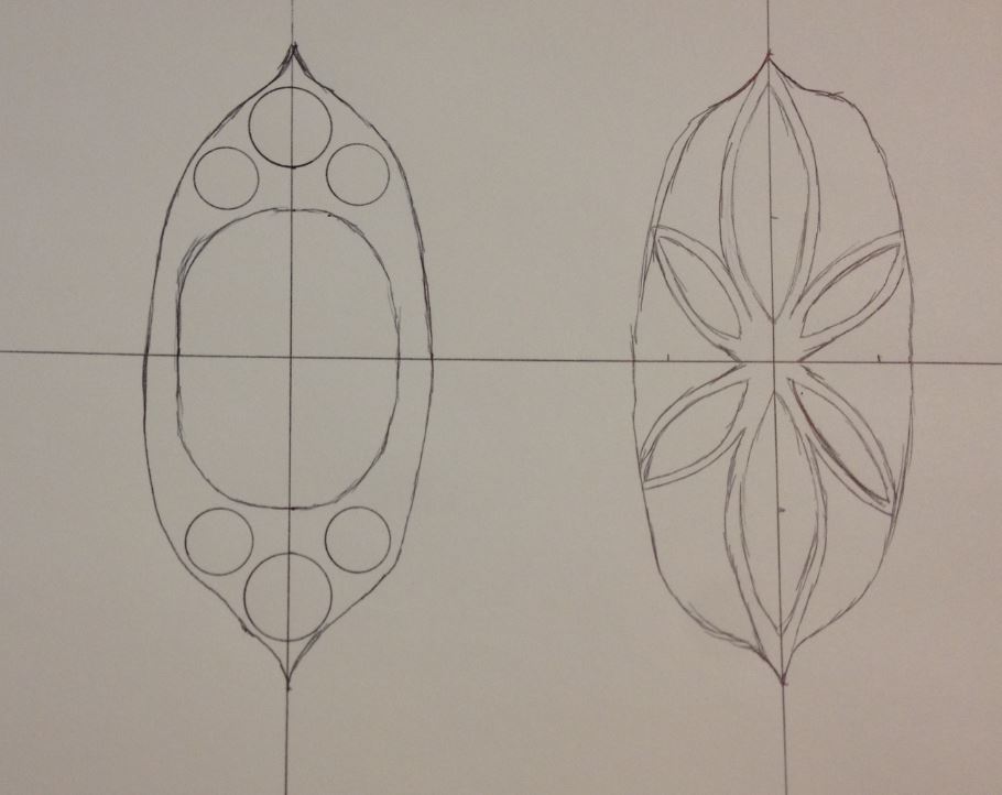
By the way, in case anyone is interested, drawing irregular shapes, especially to scale, is really quite difficult. I should probably use a pencil more often, rather than ink!

Leave a comment